Week 4 Image as Persuasion
Image 1: Poster idea 1
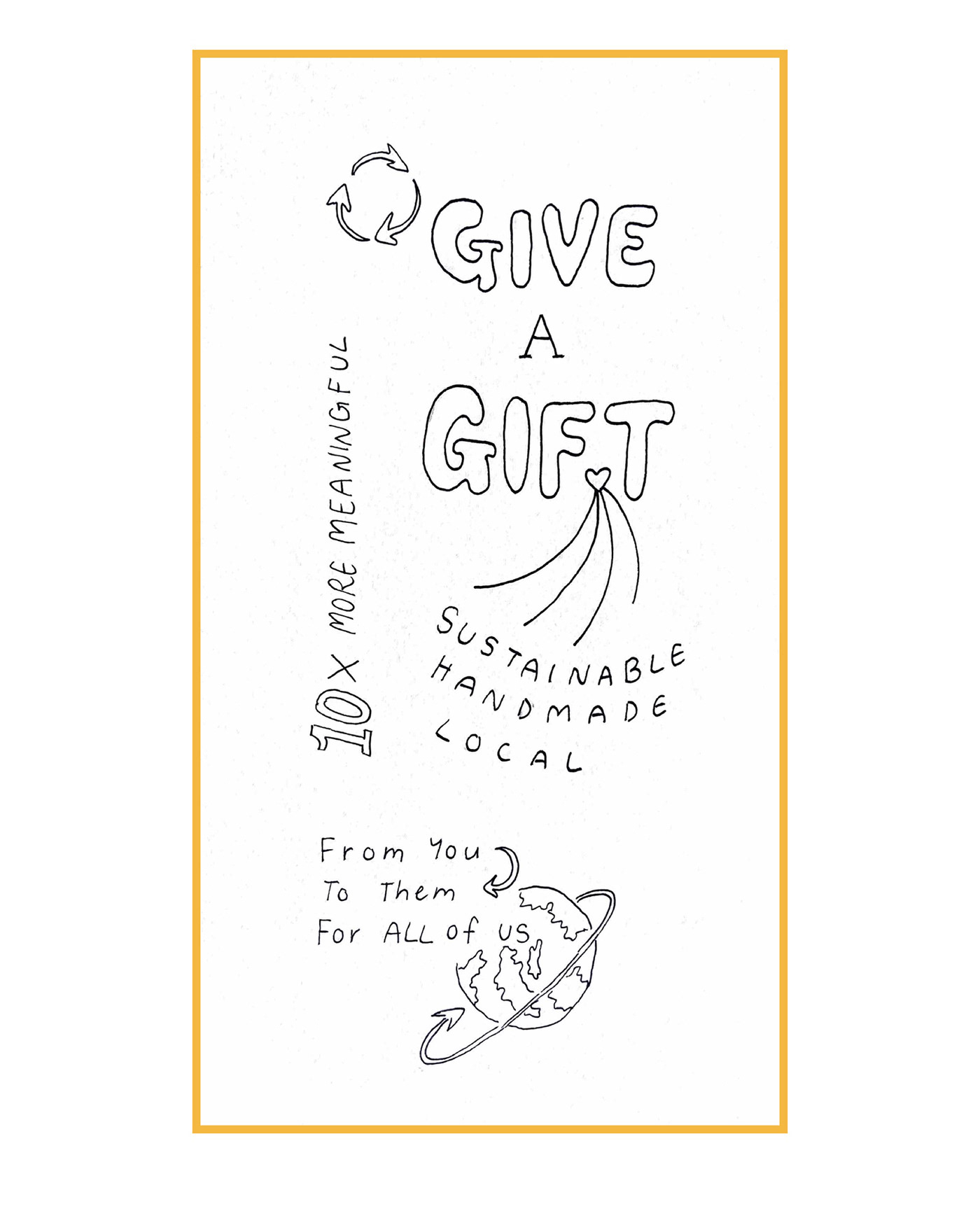
Image 2: Poster idea 2
Image 3: Poster idea 3
Image 4: Final Poster Version 1: colour technique
Image 5: Final Poster Version 2: Collage

HB pencil, 0.1-0.4 fine-liner pen
Titles (for poster ideas 1, 2, 3): Eco-friendly gifting poster iteration, It Doesn’t Have to be Done Perfectly to be Worth It, Composting poster iteration
The main concept is regarding the serious crisis of waste, (inspired by the ‘War On Waste’ BBC documentary) to one way we can improve is by considering the things we buy and give away, such as gifts. I thought it would be easy to grab the viewers attention from top to bottom, the premise in larger bubble font, and getting the message across as a whole with a recycling symbol and world icon to make a statement about the purpose of the poster. With multiple sections of simple text, it also provides enough information to be able to take action and add an incentive like ‘10x more meaningful’.
In the second iteration, I decided to make it more simple and bold so it would be easily readable from afar. It creates a powerful impact and allows the audience to reflect on if they do things to help the earth (and everyone’s value of life) or not, the recycling symbol helps provide this connection.
In the third iteration, I decided to add more context to what it could look like to take action by composting, making it more reasonable and encouraging everyone by implying it’s not about being done ‘perfectly’.

Title: Eco-friendly Gift-giving poster
Following the iteration layout, I used Adobe Creative Express to blend images to a background pattern to display subtle examples of eco-friendly gift ideas, create varying fonts with effects to seperate the text and adjoin meaning, colours synonymous with light and joyful nature and life. Also appearing a little rustic and vintage with the textured paper/fabric recycle symbol and the globe to give an organic tone. At the bottom, the QR code helps provide more information and resources.

Title: Eco-friendly Gift-giving collage poster
The collage made it appear more organic, I used a mixture of my own iteration sketch and Adobe Creative Express elements, fonts, etc. to create a crisp and clear image, sketched gift ideas and inspiration for the audience, expanding the horizons for more meaningful gifts rejuvenating life for our planet and the human race.


